HTML elements and reusable modules
This section of the style guide details the reusable modules and HTML element styles used on multiple content types. The modules are illustrated with screenshots at Desktop size. To find out further styling details about any of these modules you can right click on the relevant section of the page in Firefox, Safari or Chrome to 'inspect element'.
Headings
The core heading styles used throughout the site. Note that these are overridden on a case by case basis when used within other modules.
This is the h1: size 3.125em or 50px
This is the h2: size 1.625em or 26px
This is the h3: size 1.313em or 21px
This is the h4: size 16px (the base font size so set in px)
This is the h5: size 16px
This is the h6: size 16px
All headings have a bottom margin of 0.5ems, which will equate to half their height in px. They are all colour #333333.
Links
Here you can see a link to the Oxford University home page within the context of body text.
The link colour is #3277ae and the hover effect is an underline. There are no changes of colour for visited or focussed links.
Lists
Ordered, unordered and definition lists, styled as they would appear in the body text (with a little help from Dr Seuss).
- Today you are you!
- That is truer than true!
- There is no one alive who is you-er than you!
- You have brains in your head.
- You have feet in your shoes.
- You can steer yourself in any direction you choose.
- You're on your own, and you know what you know.
- And you are the guy who'll decide where to go.
- The Lorax
- He speaks for the trees, for the trees have no tongues.
- The Cat in the Hat
- Look at me! Look at me! Look at me NOW!
Tables
Basic table as it would appear when added to the body text with the TinyMCE editor
| The Lorax | The Cat in the Hat |
|---|---|
| Shortish | I can hold up two books |
| Oldish | I can hold up the fish |
| Brownish | and a little toy ship |
| Mossy | and some milk on a dish. |
Same as above but with the 'table-striping' class applied
| The Lorax | The Cat in the Hat |
|---|---|
| Shortish | I can hold up two books |
| Oldish | I can hold up the fish |
| Brownish | and a little toy ship |
| Mossy | and some milk on a dish. |
Related websites, related pages, related documents and related content
To visually distinguish various areas of pages subtle ‘warm gray’ background shades are used (derived from the Warm Gray pantones in the palette). These help to separate tertiary content from main content without being over-powering or distracting.
The sidebar modules all have a padded #f3f1ee background. Where multiple sets of related content are added to a page they are grouped together separated by a 1px bottom border with colour #e0ded9.
The header text is an h2 element set to font-size 1.125em, which equates to 18px. The listing styles for related content, related pages and related websites use the listing bullet background image and the font size is the base size of 16px. The related documents use an appropriate background image for each document type used. The relevant images can all be found along the path of '/sites/default/themes/custom/oxweb/images/[filename].png.
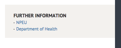
Screenshot of the related content module
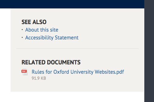
Screenshot of the related pages and related documents modules grouped together
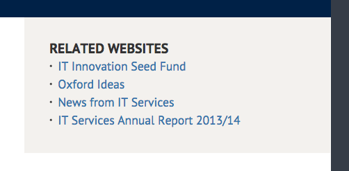
Screenshot of the related websites modules
More / less
The more / less module allows for FAQ style listed content, which expands to reveal more content when clicked
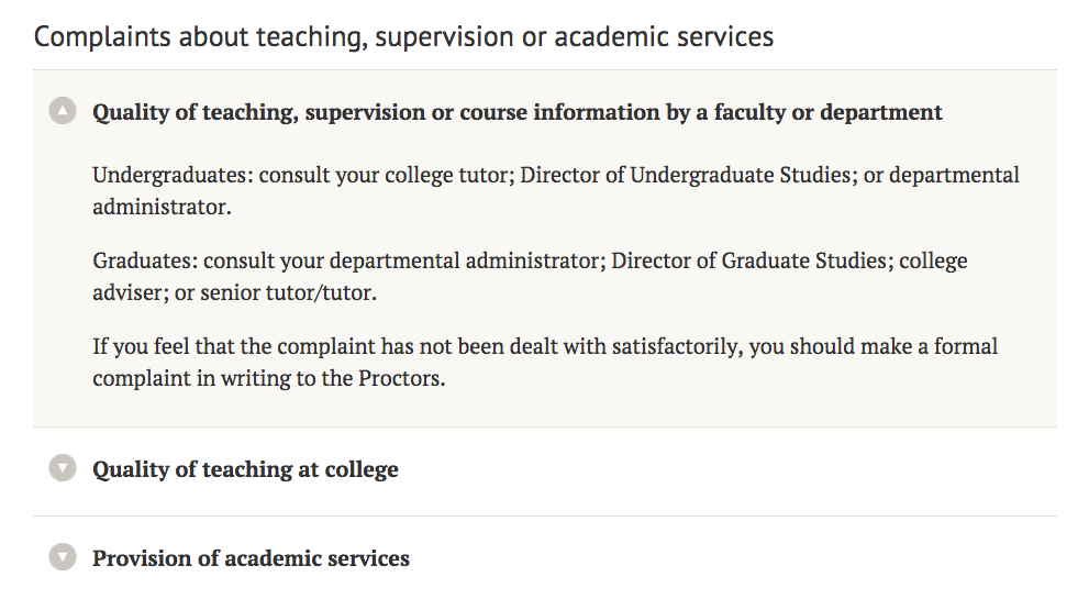
Screenshot of the more / less module
Each piece of content consists of a div with class 'more-less' containing an h3 heading with text in paragraphs below. The hide / show state is toggled by a 'show' class on the 'more-less' div. The div has padding of 0.5 em (equates to 9px) and the h3 within that has padding of 5px 10px 5px 40px. The h3 heading has a dark red colour on hover (#be0f34). When the 'show' class is applied the paragraph content below the h3 becomes visible and the containing div background colour is set to #f9f8f5. There is a background image of a downward-pointing arrow on the h3 which changes to an upward pointing arrow when the content is expanded.
Blockquote
Example of a blockquote as it would be used with a citation within the body text.
Education is the most powerful weapon which you can use to change the world.
Nelson Mandela
Buttons
The button styling can be applied to both a button tag or a link tag. Below are examples for both. A distinctive red colour (derived from Pantone 200 in the palette) is used to highlight key/primary call to actions (for example the ‘APPLY’ button on the course template). This is to give it more visibility over other less important actions on the page.
Basic button styles
Button styling applied to a link tagAn example of custom button styling
Did you know module
Secondary colours (derived from the main palette) are used sparingly to give specific components their own distinctiveness and compliment the core Oxford blue used throughout. An example of this is the teal used here (derived from Pantone 562 in the palette).
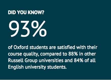
Screenshot of the did you know modules
The content for this module sits within a div with the class of 'did-you-know'. It has a background colour of #003947, and padding of 1em top and bottom, and 2em left and right. The text is styled as per other sidebar modules, with the exception that it is white. However, any text within this can be given the 'large-emphasis' class (for the percentage in the example above). This adds a top and bottom margin of 0.5em and sets the font size to 500%.
Pager
The pager element is used on any list of items covering more than one page, for example the event listing.
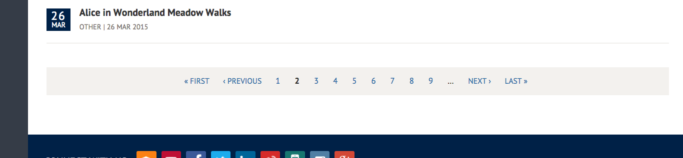
Screenshot of the pager module on the events listing
The pager element is an unordered list with a class of 'pager' on the 'ul' element. There is an 'li' element surrounding each page link in the pager, including for the 'first', 'previous', 'next' and 'last' links. These items have the chevrons included in the markup rather than generated in the CSS.
The 'ul.pager' class has a top margin of 1.846em (equates to 24px). It has top and bottom padding of 13px, and left and right padding of 20px. The font-size is 0.938em (equates to 15px). The background-color is #f3f1ee and the text-align is set to center so the links are centered within the pager block.
Each 'li' element has a padding of 0.5em and a right margin of 0.5em. The display for the 'li' element is 'inline-block' so they are stacked left to right rather than top to bottom.
Tabs
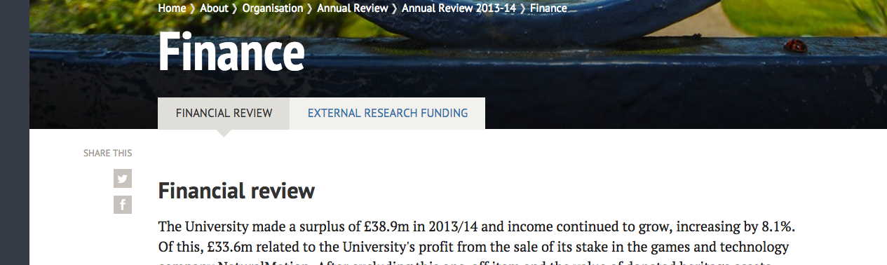
Screenshot of the tab module
The tabs for this module are generated using the jquery.ui tabs module (https://jqueryui.com/tabs).
A surrounding div called 'tab-wrapper' sits around all the tabs and their content, and when there is a main image on the page as per the screenshot above, this div is given a negative top margin of -41px, so that the tabs overlay the image.
The tab links are generated with an unordered list. The surrounding 'ul' has a class of 'ui-tabs-nav'. This is given a bottom margin of 1em to create space above the content below. Each tab is an 'li' element surrounding a link. Each 'li' is floated left. When a tab is active (i.e. its content is displayed below), the 'li' element is given a class of '.ui-tabs-active'. The default background colour for the 'li' is #f3f1ee, whereas it is #e0ded9 for the active tab. The 'li' has left and right padding of 0.5em, and the position is set to relative. The position property is important for the child link element which requires absolute positioning to generate the bottom arrow style.
The 'a' element within each 'li' is set to display block, and has a font size of 0.938em (equates to 15px). The padding on the 'a' tag is 0.7em top and bottom, and 1em left and right. An absolutely positioned pseudoclass on the 'a' element creates the arrow beneath the tab.
Forms
Forms are generated using the Drupal 'webform' module. Below is an example form, showing the styling for a text field, an email address field, a textarea, radio buttons and a select box. It also demonstrates styling for required elements and for description text.
Graphical teaser
Images used here should have good contrast and saturation and be closely cropped on the subject area for better impact. Avoid the use of stock imagery and use photos of real people associated with the University where possible.
Screenshot of the graphical teaser module
The graphical teaser consists of an image plus a textual link to a particular page. The surrounding div has a bottom margin of 20px to create space below it. It also has a position set to relative to allow the text to be absolutely positioned within it.
The 'img' tag is set to a width of 400px within the markup but can have variable height.
The link text is set within a 'div' element with class 'field-name-field-gt-caption'. This is absolutely positioned, with the bottom property set to 0 - this means that the text overlays the image. The width of this element is 80% so that it does not completely fill the width of the image behind it. The padding of this element is 0.923em top and bottom, and 8.475734792% left and right (the percentage value is calculated based on the gutter width multiplied by 4).
The text size on the link element is set to 1.313em (equates to 21px), and it has a bottom margin of 0.5em. The right padding is set to 1em to allow spacing for the grey arrow. This is a background image set on the 'a' tag and aligned to the right, and it can be found here: http://www.ox.ac.uk/sites/default/themes/custom/oxweb/images/dark-grey-chevron.png.
Contacts
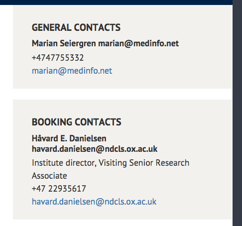
Screenshot of the contacts module
The contact details sit in the right hand column within a 'div' element with a class of 'field-name-field-contact'. The background colour of this div is set to be #f3f1ee, and the padding is set to 20px top and bottom, and 8.475734792% left and right (the latter value being 4 times the grid gutter width). It has a bottom margin of 20px creating the spacing between each item.
The capitalised heading is a 'label' element with a bottom margin of 0.45em, bold text and the 'text-transform' property set to 'uppercase'.
The contact name and email address sit in an 'h3' element with a bottom margin of 0.3em and bold text.
The contact job title, phone number and email address each sit within their own div with no special styling.
Generous padding within these boxes reflects the design style across the site, ensuring content has space to breath.