Modules from basic pages
This section of the style guide details the layout modules in the Page content type. The modules are illustrated with screenshots at Desktop size. To find out further styling details about any of these modules you can right click on the relevant section of the page in Firefox, Safari or Chrome to 'inspect element'.
Main image, header and breadcrumb
This forms the distinctive style for the top of the Page content type, with the page content overlapping the main image. Note that the main image may also be a carousel if more than one main image is added per page.
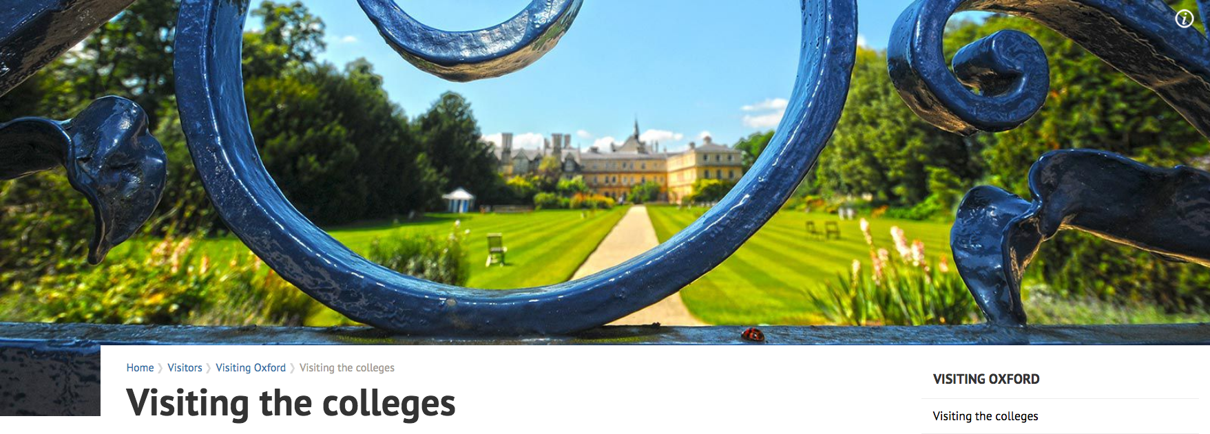
Screenshot of the header module
The main header uses the standard h1 styling for the site:
Visiting the colleges
The breadcrumb style uses the base font size and the standard link colour. The last item in the breadcrumb is not a link, and has the colour set to #a79d96. The arrow is created by a background image:
The image is set to 100% width and auto height so that it retains its proportions (it is an 'img' element rather than a background image)
The breadcrumb and heading text sit within the 'main-content' div, which is given a relative position and a negative top-margin of -93px in order to gain the effect of it sitting above the image.
Page listing
The listing styles can be used for A to Z or other listings within a page. They comprise an initial list of anchor links followed by the list of content. There is a link back to the top after each listed content item.
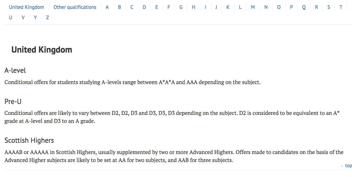
Screenshot of the listing module
The anchor list has a solid bottom border of 2px with colour #f3f1ee. Each item has right-hand border of 1px in the same colour. It uses the standard link colour. The font size is 0.938em, equating to 15px.
Each content section has a solid bottom border of 1px with colour #f3f1ee and a top padding of 1em. The last item in the list should have no bottom border. The heading of each section is an h2 element with a left hand margin of 0.8em.
Share this
A module to share content via Twitter and Facebook.
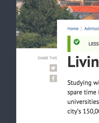
Screenshot of the share this module
The share this module sits to the left of the main content in the left column. It has a 25px top margin to create the gap between it and the image above. The heading is an h2 element rendered in upper case, colour #a79d96 and at size 0.75em which equates to 12px.
The Facebook and Twitter icons can be downloaded here:
They are rendered as background images on meaningful link text, which is hidden in the CSS using the text-indent property.
Menus

Screenshot of the main menu at top level
At the top level the main menu has 4 entries for key areas of the site in large size text (1.313em equating to 21px).
Screenshot of the main menu at a secondary level
At deeper levels of the site the 4 main areas are shown at a smaller size and the focus is on the area of the site you are visiting, shown below. Drop down arrows show where it is possible to drill deeper into the site, and the current page is highlighted in blue (#70a9d6).

Screenshot of the sticky main menu when scrolled
The top menu is sticky and a reduced version of it will remain at the top of the screen as you scroll down the page. For the top level (as in the screenshot above) this shows the four main areas of the site. For inner pages it is the current section that remains visible.
Screenshot of the secondary menu
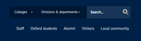
On the home page a secondary menu is present giving quick links to other areas of the site and targeting specific audiences.
Search
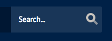
Screenshot of searchbar
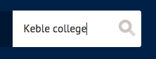
Screenshot of the searchbar when active
The search box is absolutely positioned to the right of the header. The input box background is initially 10% opacity creating the effect of a slightly darker colour than the header blue (see first screenshot). On clicking into the box a toggle class is applied to the surrounding block which changes the background colour to white and the text colour to #333333 (see second screenshot). The input box has a border radius of 3px creating the curved edge. The label element is hidden in the CSS.
The search icon is created using a background image on the submit button.
At reduced screen sizes and within the sticky header the text input for the search is hidden, but becomes visible on clicking the search icon.
Connect with us

Screenshot of the connect with us module
The list of icons is an unordered list containing links to each social media site. The links are textual links styled with a background image and the text offset using the 'text-indent' CSS property. Each icon is 36px x 36px and separated by a margin of 9px. They have a border-radius of 3px to create the curves and the background colours are set as per the social media colours in the 'building blocks' section of this guide. The background images are created from a sprite which also contains the hover states for each icon.
Footer menu
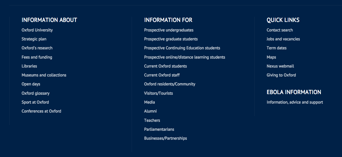
Screenshot of footer menu
The footer menu is on every page, and acts as a sitemap to the most important pages in the site.
Each section of the menu is formed of an unordered list with an h2 heading within a div of class 'sitemap-item'. This div has a 1px left hand border of color #122f53, which creates the dividing lines, and a width of 25%. Each li element (containing one menu item) has a bottom spacing of 0.3em, equating to roughly 5px. The font size is the base size of 16px. Each link element has an initial opacity of 0.75 which changes to 1 on hover.
Bottom links
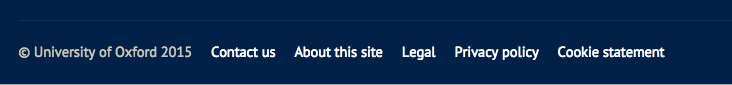
Screenshot of bottom links
The bottom links appear on every page and include the copyright notice and links to contact us, legal info etc. The bottom links block has a 1px top border of ##122f53. The links are marked up with an unordered list, and each list item has a 1em left margin to create the spacing. The text is at the base font size of 16px, and the links do not have a hover effect. The copyright notice is not a link and is in the colour #c7c2bc.